In typography, the mean line is the imaginary line at the top of the x-height.1
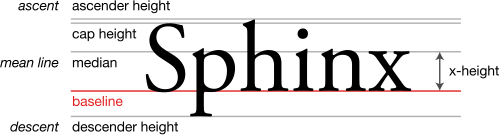
Round glyphs will tend to break (overshoot) the mean line slightly in many typefaces, since this is aesthetically more pleasing, otherwise curved letters such as a, c, e, m, n, o, r, s, and u will appear visually smaller than flat-topped (or bottomed) characters of equal height, due to an optical illusion.
References
References
- Felici, James (2011). The Complete Manual of Typography: A Guide to Setting Perfect Type, Second Edition. Adobe Press. p. 315. ISBN 978-0-321-77326-5.
External links
External links
- Page 315 The Complete Manual of Typography: A Guide to Setting Perfect Type, Second Edition by James Felici