 | |
| Category | Serif |
|---|---|
| Classification | Humanist slab serif |
| Designers | Tobias Frere-Jones Jonathan Hoefler |
| Foundry | Hoefler & Co. |
| Date created | 2001 |
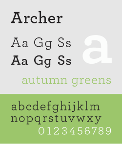
Archer is a slab serif typeface designed in 2001 by Tobias Frere-Jones and Jonathan Hoefler for use in Martha Stewart Living magazine.1 It was later released by Hoefler & Frere-Jones for commercial licensing.
Structure
The typeface is a geometric slab serif, which takes inspiration from mid-twentieth century designs such as Courier and Landi.2 Ball terminals were added to the upper terminals on letters such as C and G to increase its charm.32 Italics are true italic designs, with flourishes influenced by calligraphy, an unusual feature for geometric slab serif designs.24
Uses
The typeface has been used for, among other things, branding for Wells Fargo and is a main font for the San Francisco Chronicle and Wes Anderson's film The Grand Budapest Hotel.5
References
References
- de Wilde, Barbara. "Martha Stewart Living". Barbara de Wilde. Retrieved 4 July 2023.
- Wilson, Doug. "Designing Archer". Frere-Jones Type. Retrieved 4 July 2023.
- Devroye, Luc. "Jonathan Hoefler". McGill University. Retrieved 29 September 2014.
- Earls, David John. "Archer". Typographica. Retrieved 11 July 2015.
- Adams, Lauren. "Is Archer's Use on Target?". AIGA. Archived from the original on 26 October 2019.